
The founder had developed an analog property management system focused on maintaining and protecting a home and its occupants. It included tools for budgeting, upkeep, task management, contractor coordination, and property insights.
My role was to translate this into a scalable digital product, defining the UX, system architecture, and design foundation for two distinct audiences: homeowners and professional property managers.
Drive & Execute Design Strategy. Led discovery and design strategy using interviews, market research, and systems thinking to align product vision with user needs.
Design Ops. Built lightweight but scalable processes for collaboration, delivery, and iteration under tight time and resource constraints.
Cross-functional Alignment. Collaborated daily with the CEO, CTO, and Head of Product to ensure feasibility, scope clarity, and brand consistency.
With limited access to users and the field, I developed a lean research approach. It leveraged targeted interviews, competitive analysis, and AI-assisted synthesis to rapidly form and validate hypotheses.
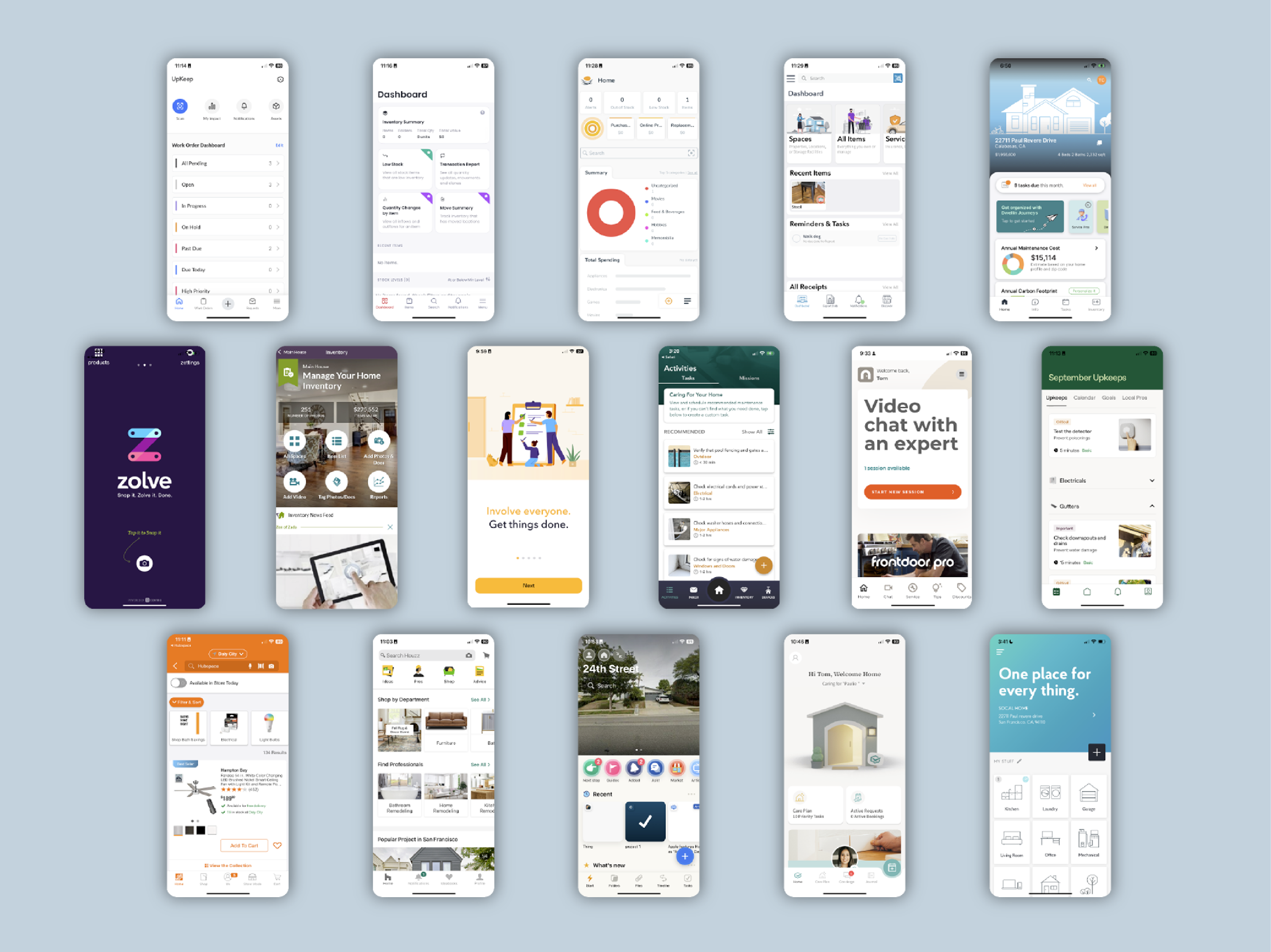
I conducted thorough research and analysis of direct and tangential competition.
This enabled us to fine tune our product market fit and identify opportunities to differentiate ourselves.
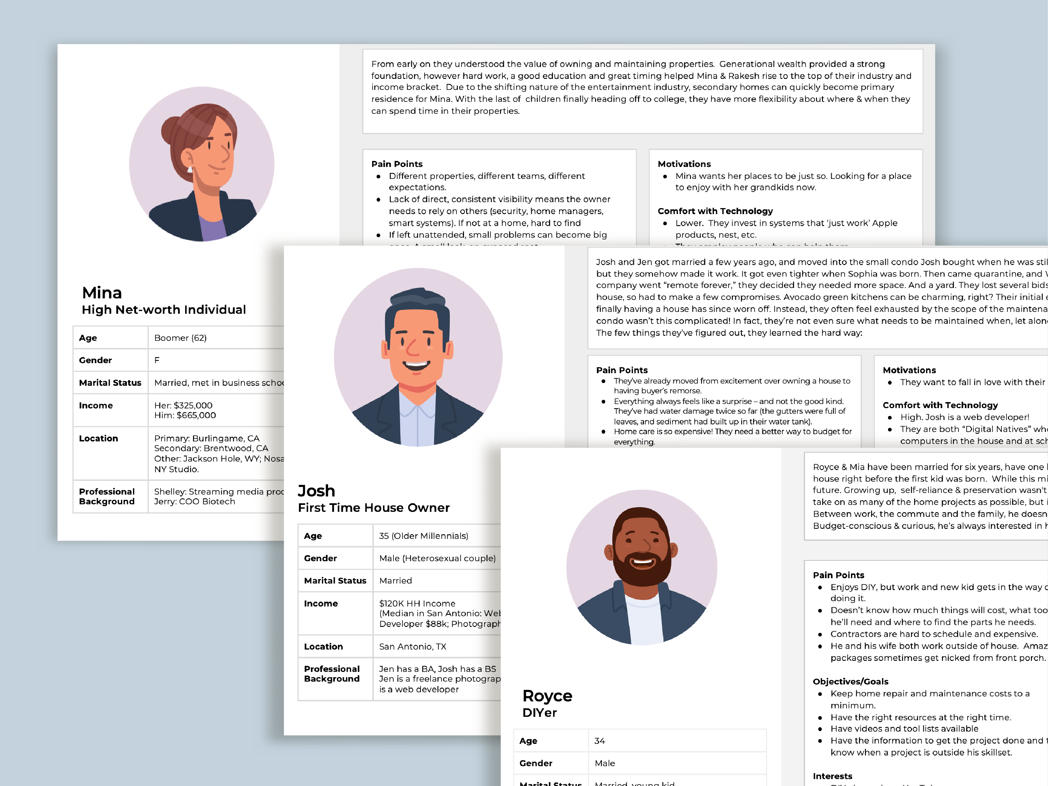
I didn't have access to a broad set of users. I compensated by repeatedly interviewing a half-dozen champions and by tapping into AI tools.
Two distinct audiences emerged with different needs and different stakes.
That split drove every major platform decision that followed.
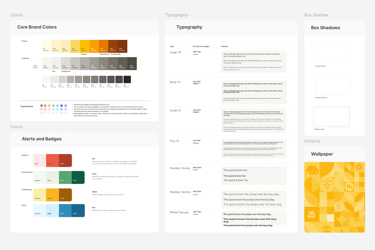
Balancing the desires of the owner, the market and the users, I developed a foundational brand and design system.
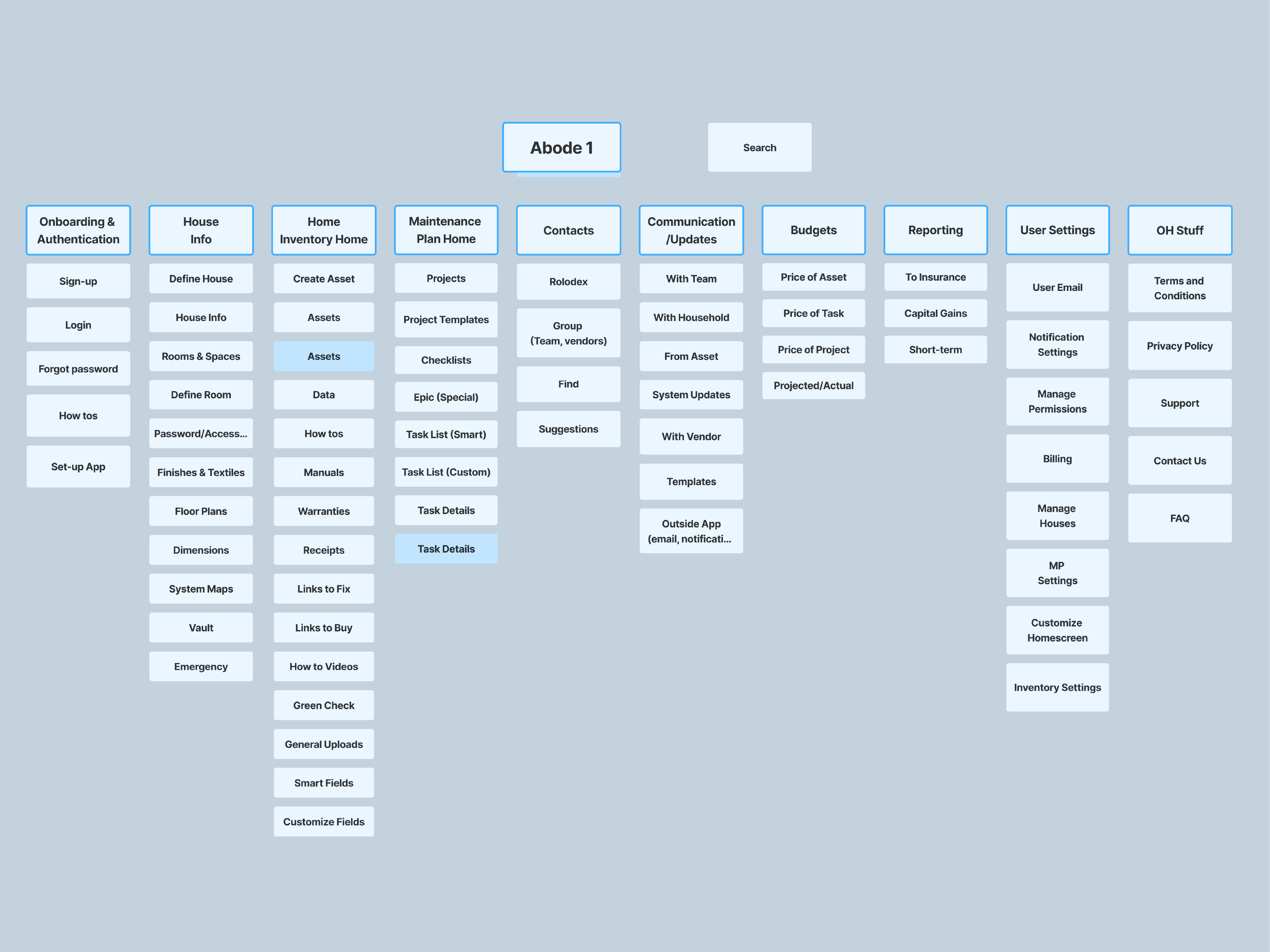
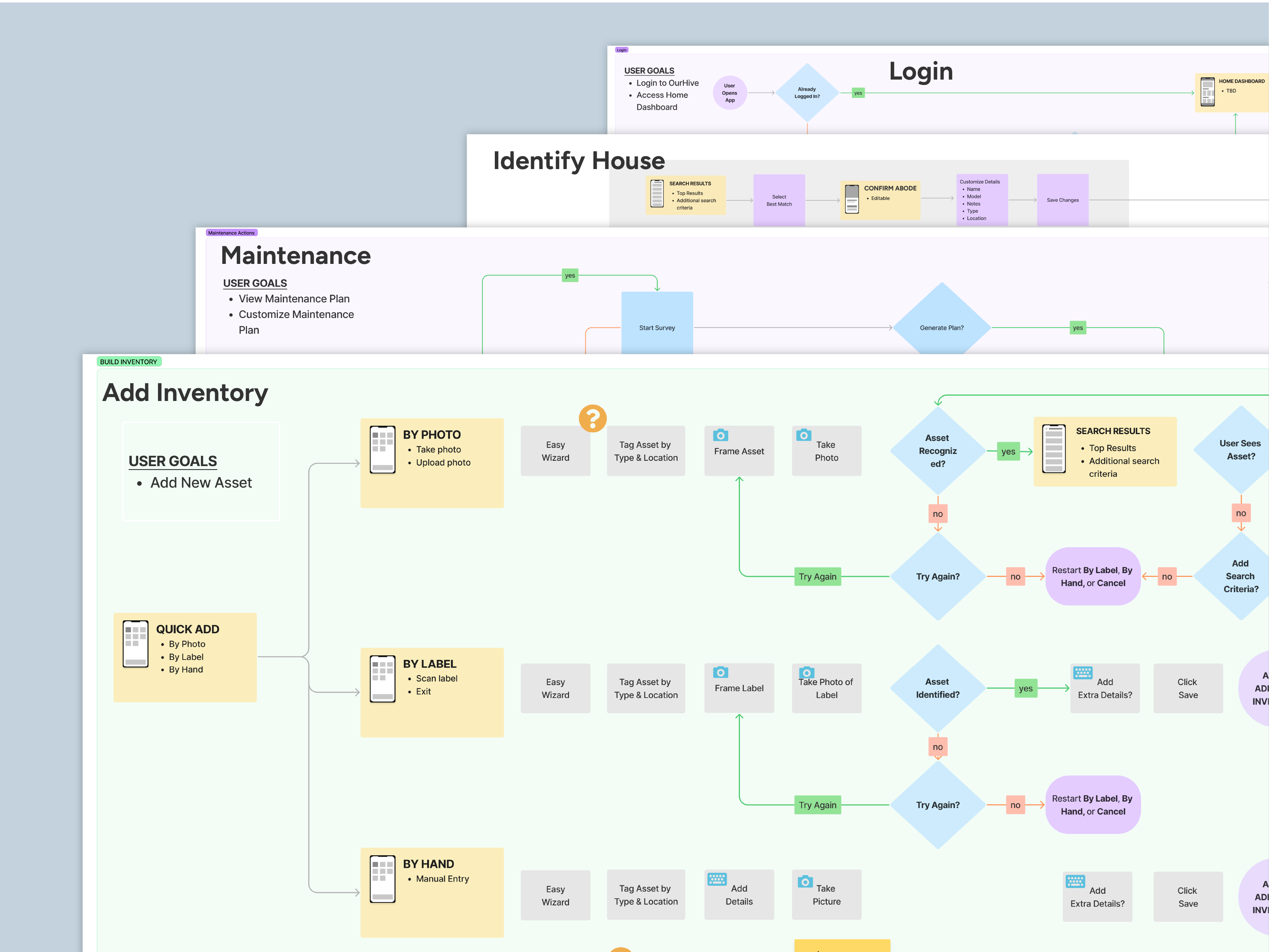
After defining key personas and mapping core user journeys, I developed the information architecture, user flows, key design system moments.
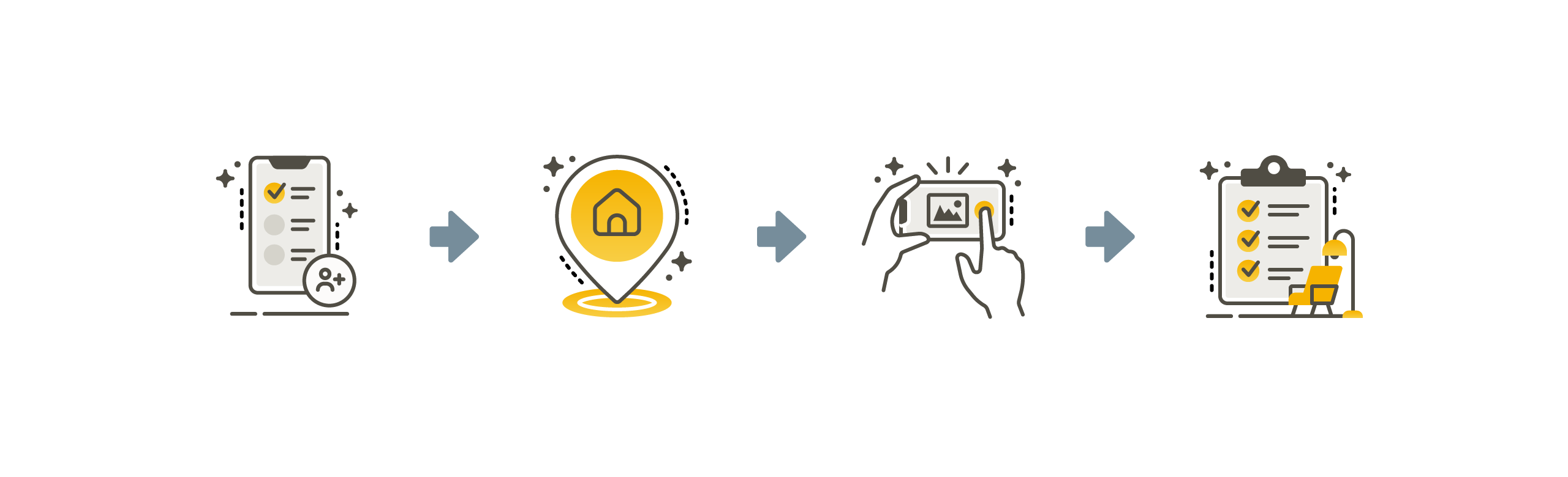
The principal function of the app was to deliver a personalized maintenance plan to our users. This plan was developed in four steps: build your team, add your house, build your inventory, customize your plan through use.
The structure allows users to reach value quickly while supporting deeper engagement over time.
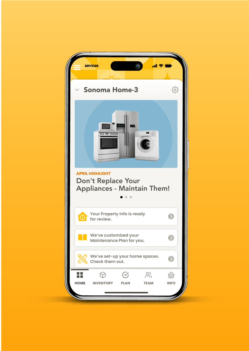
I prioritized mobile for onboarding and data capture, where users could quickly build their home inventory.
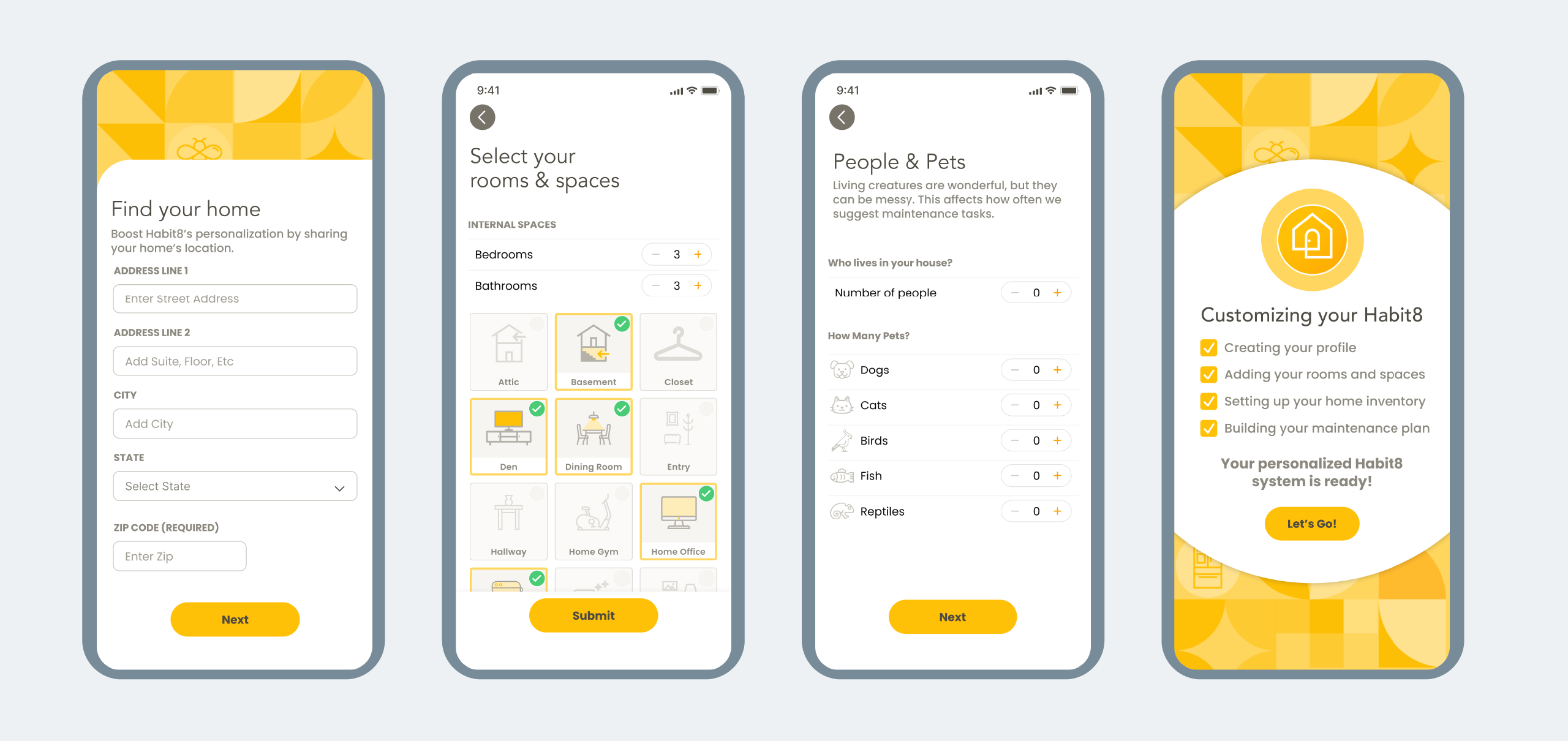
I designed the onboarding screen to be light, quick and intuitive. We debated the structure and depth of the onboarding set-up. I convinced the team to make this is minimal as possible so the users could experience the value of the app as soon as possible.
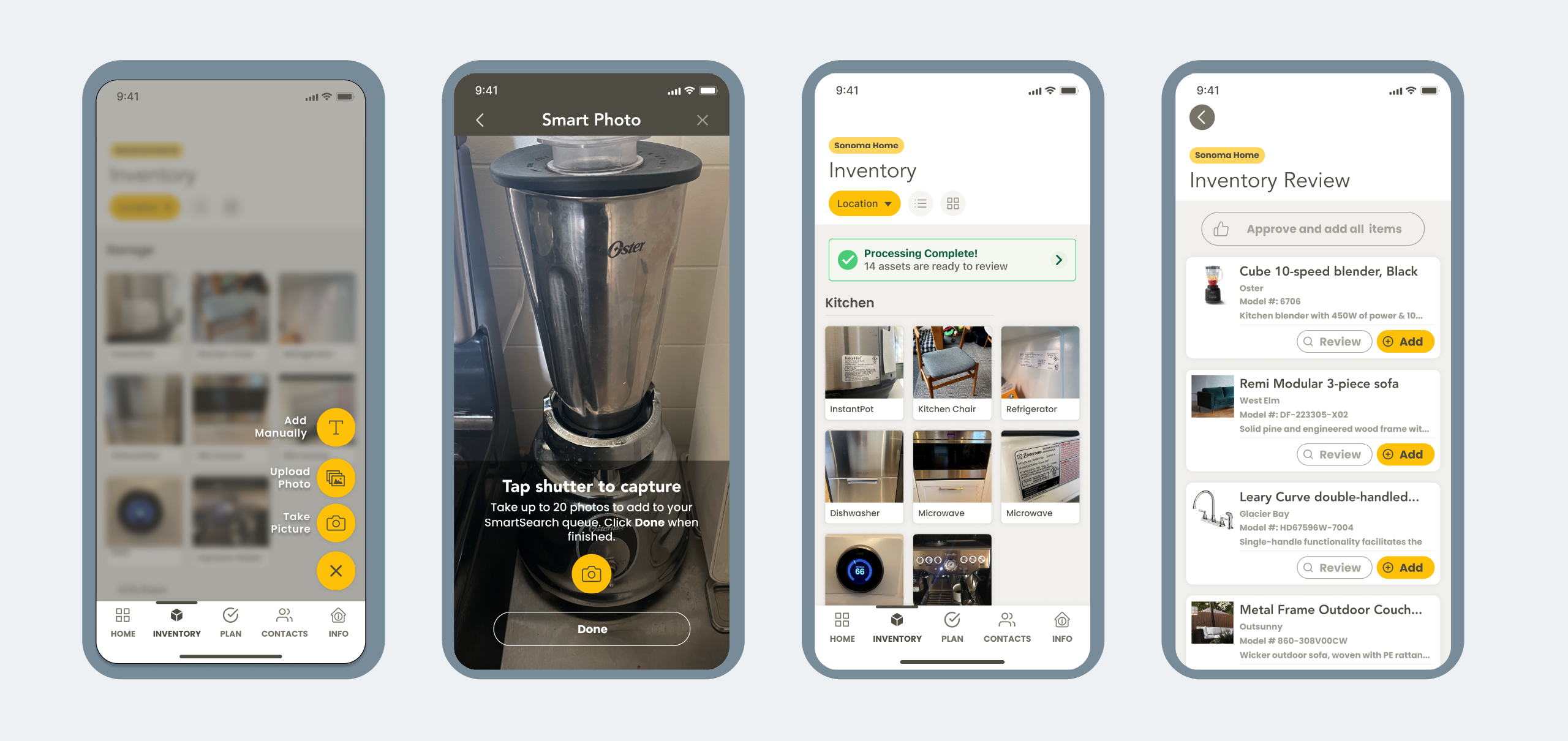
Most users don't know the make, model, or purchase source of what they own. Manual entry would have produced incomplete data and an unreliable maintenance plan.
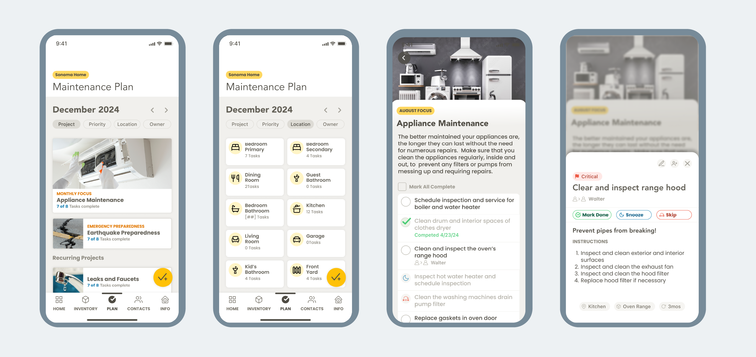
After identifying a home’s inventory, I create a tailored maintenance plan that adapts to the user’s needs. They can then delegate tasks, customize routines, and uncover helpful resources for proactive home care.
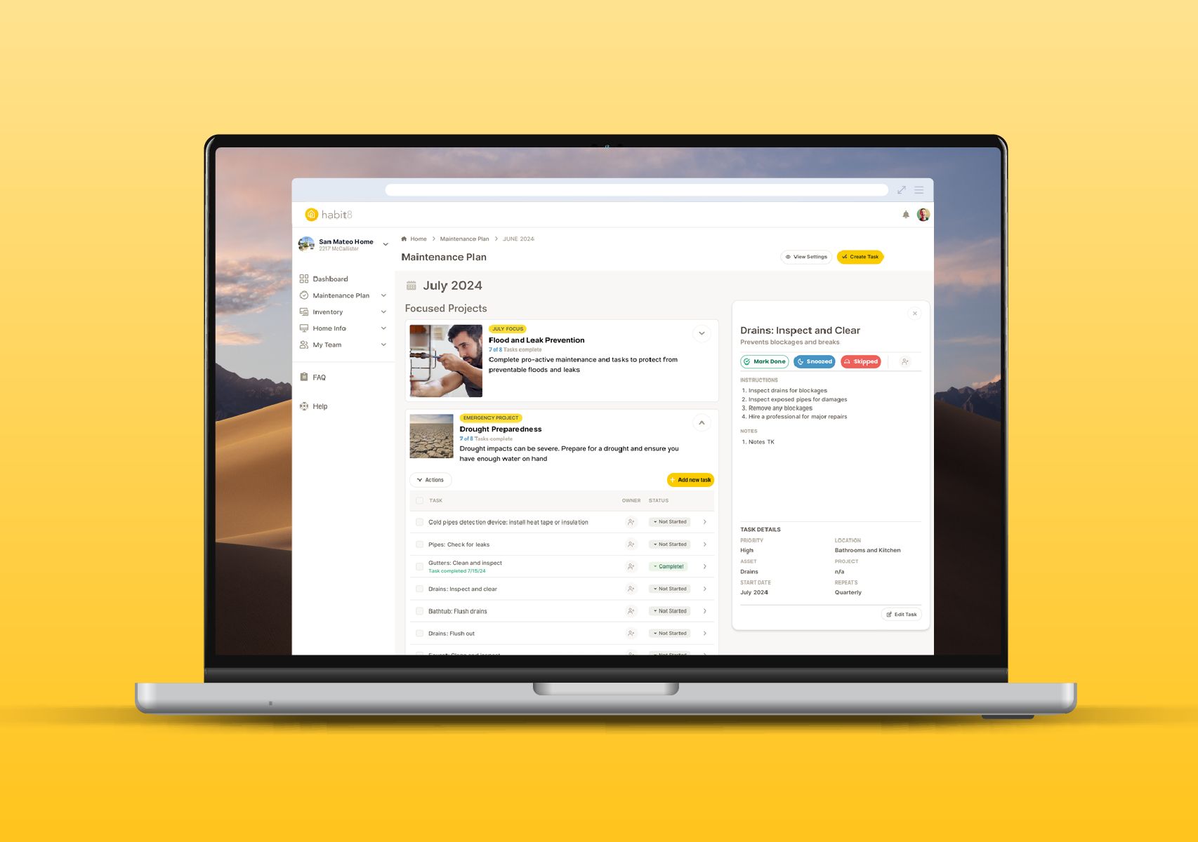
Desktop was built for property managers.The larger canvas allowed for richer data display, open navigation, and a dashboard experience that gave power users everything at a glance.
Setup runs as a guided four-step flow so a property manager can stand up a full home profile in one sitting, not piecemeal.
The desktop home surfaces multi-property status, team, and budget in a single view. That's oversight a PM needs at a desk, not a phone.
Recurring work is organized by month and made fully customizable, so managers schedule against real seasons and client needs, not a fixed template.
A single job opens into scope, assigned team, budget, and progress in one frame. Managing the work, not just listing tasks.
Every owned asset lives in one room-by-room view, feeding the same digital-twin system the mobile capture builds.